Conveying financial and ESG performance, as well as company values, in a clear and structured way.
Surprisingly, the majority of those who read a company's annual report are either employees (current, potential or past) or customers*. Although they may be interested in financial performance, they also seek information on a company's culture and societal contribution. Therefore, it is crucial for an annual report to reflect a company’s values and vision for the future.
Focus groups also show that more than half of readers will skim read - looking for headlines, charts and graphics. Creating the optimum reader experience by highlighting key information serves both the audience and the messages being conveyed.
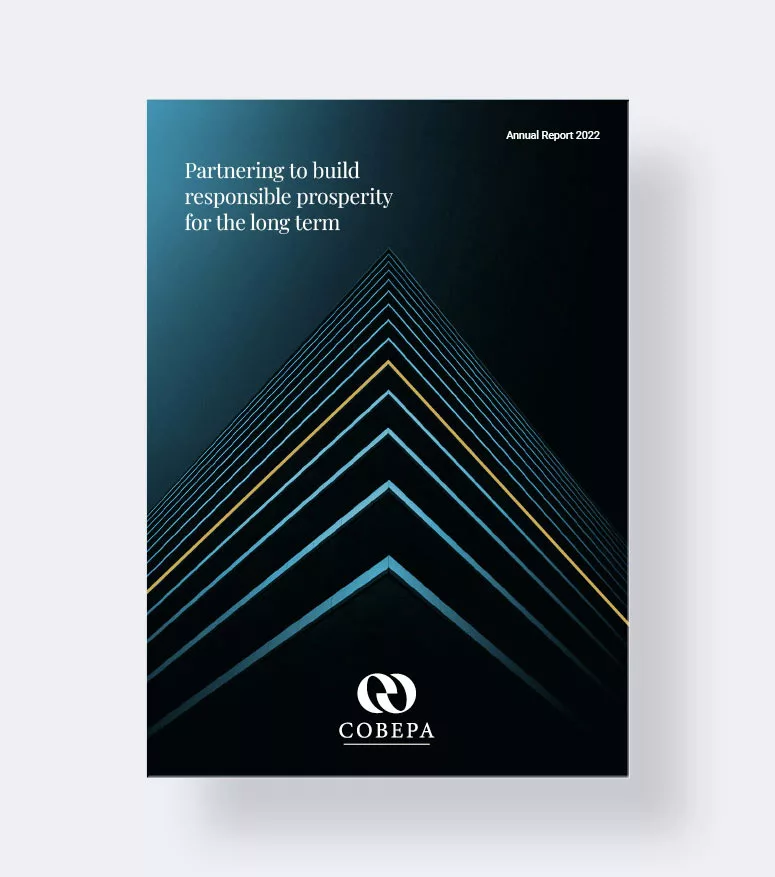
Cobepa needed to convey their financial and ESG performance, as well as their purpose through their Annual Report in a clearly organised way.
*Radley Yeldar, The battle for annual reporting, December 1, 2019
We reinterpreted Cobepa's identity to depict a stable and solid brand with values of responsible prosperity and durable partnerships. The report was developed for both print and screen use.
Infographics convey complex information, enabling animation on both desktop and mobile devices.

Our new design for Cobepa’s annual reports helped effectively communicate their new purpose for the years to come: Partnering to build responsible prosperity for the long term.
The presentation of facts & figures throughout the document facilitates the reader experience; communicating the most important information succinctly.

Get in touch to discuss how Landmarks can help you.